
Moving Company Website Design
Built Around Your Customer
Good design isn't decoration. It's knowing who your customer is, what they need to see before they trust you, and which words make them pick up the phone. That's what we design around.
Go Play With Our Homepage

I'm Goran, co-founder of Move Accelerator, and I design everything you see here. I have ADHD, so ideas are never the problem. Finding somewhere to put them all is. A lot of them ended up on our homepage.
Goran Gajinov Co-Founder, Move Accelerator✓ A Rocket That Dodges Comets
Our logo flies around the page avoiding comets. Each comet has a 10% chance of actually hitting it. And yes, it explodes.
✓ Lightning On Your Cursor
Move your mouse on a computer and it throws sparks. You've probably noticed it on this page already.
✓ A Click Game With A Punchline
Play it and a joke pops up that nudges you to call us. Marketing doesn't have to be boring.
✓ Bubbles Around The Founders
Scroll down to our photos, hover over them, and see what happens.
Every blog image and thumbnail on this site is mine too, and so is the design work for our clients. Go try the homepage, then come back. The next part matters more.
Your Website Isn't Our Playground
All of that is us showing what we can build. Almost none of it belongs on a moving company's website.
That's How Fast People Judge A Website
Google researchers found that people form a gut feeling about a site in under 50 milliseconds, and the designs they rated best were simple and familiar.
Someone looking for a mover is usually stressed and short on time. They want three answers fast: can I trust you, do you do what I need, and how do I get a quote.
So on your site, the creativity goes where your customer will never notice it: into the research, the words, the order of the sections, and the form. A good first impression gets you a look. Everything after that is what gets you the job.
First We Find Out Who Your Customer Is
Before we choose a color or write a headline, we look at who actually lives in your service area and who is already competing for them. You can't design for a customer you haven't met.
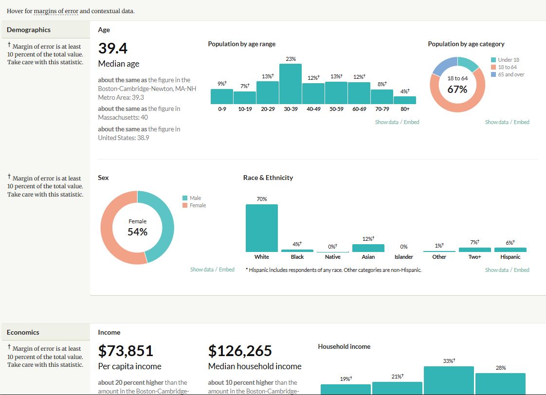
An example of the area research we run before we design anything.
Who Lives There
Who your customers are, what stage of life they're in, and what they care about when they let a mover into their home.
Who You're Up Against
We go through every competitor's website and note what each one does well and where it falls short. Then we build something better than all of them.
What That Changes
The photos, the sections, the tone, even which service comes first. A city of young renters and a suburb of retired homeowners need two different websites.
The same research shapes the ads. We walk through that side in our moving company marketing strategy.
Every Section Has One Purpose: More Trust
A stranger is about to let your crew into their home and hand over everything they own. Each section of your site should make that feel a little safer than the one before it.
Judged Credibility By How The Site Looked
A Consumer Reports study had 2,684 people rate how credible websites were and explain why. The thing they mentioned most, in 46.1% of comments, was how the site looked.
The order matters, and it depends on your strengths. A company with a strong reputation puts its reviews near the top. A newer company might open with the owner's story or a clear promise instead. Here is what that looks like on a site we built for Runner Runner in Philadelphia.
✓ A Real Person Up Front
The headline reads "You're Hiring Antoine, Not a Call Center." Customers know exactly who shows up and who answers for the job.
✓ Promises In Plain Words
"No Mystery. No Surprises." followed by specific promises, including that the quote equals the invoice.
✓ Reviews Where They Count
Reviews with names and neighborhoods, placed early on the page and again further down, right before the visitor decides.
✓ Pricing Explained Honestly
A section that shows how the price is worked out, so nobody has to wonder what the catch is.
The Words You Choose Pick Your Customers
Researchers at Stanford's business school set up a lemonade stand run by two six year olds and rotated three signs, one at a time. Customers could pay anything from $1 to $3 a cup.
The Customers, And Almost Twice The Money
The sign about time attracted twice as many people as the sign about money, and they were willing to pay almost twice as much. Same lemonade, same kids, different words.
Now think about how many moving companies put "Affordable Movers" at the top of their website, then wonder why every lead only wants the lowest price. The headline invited them.
The first thing the visitor thinks about is money, so money is what they compare you on.
The first thing the visitor thinks about is how the move will feel. Price comes later, and it comes with trust.
This doesn't mean hiding your prices. For one client we built a page explaining exactly how his pricing works. He wasn't sure about it. It became one of the pages where a lot of his quote requests start. Being clear about price builds trust. Leading with cheap attracts people who only care about cheap.
The Form Is Where Jobs Are Won Or Lost
A short form gets filled in more often but tells you almost nothing about the job. A long form tells you everything, and a lot of people quit before the end. The right answer sits somewhere in between, and it's different for every company.
Fewer Fields, Fewer Leads
Conversion specialist Michael Aagaard cut a lead form from 9 fields to 6, expecting more leads. He got 14% fewer. He had removed the fields people actually wanted to fill in. He put all 9 back, rewrote only the labels, and got 19.2% more.
So we don't follow a rule about form length. We ask for what you need to price the job, in an order that feels easy, and then we watch what real visitors do with it.
Designed For The Phone First
In one of our Google Ads campaigns, about 9 out of 10 visitors came from a phone. So we design for the phone and then adapt to a computer, not the other way around.
That includes the form: big buttons, one question at a time, nothing to pinch or zoom, and the contact details asked last, after the visitor has already put in the effort.
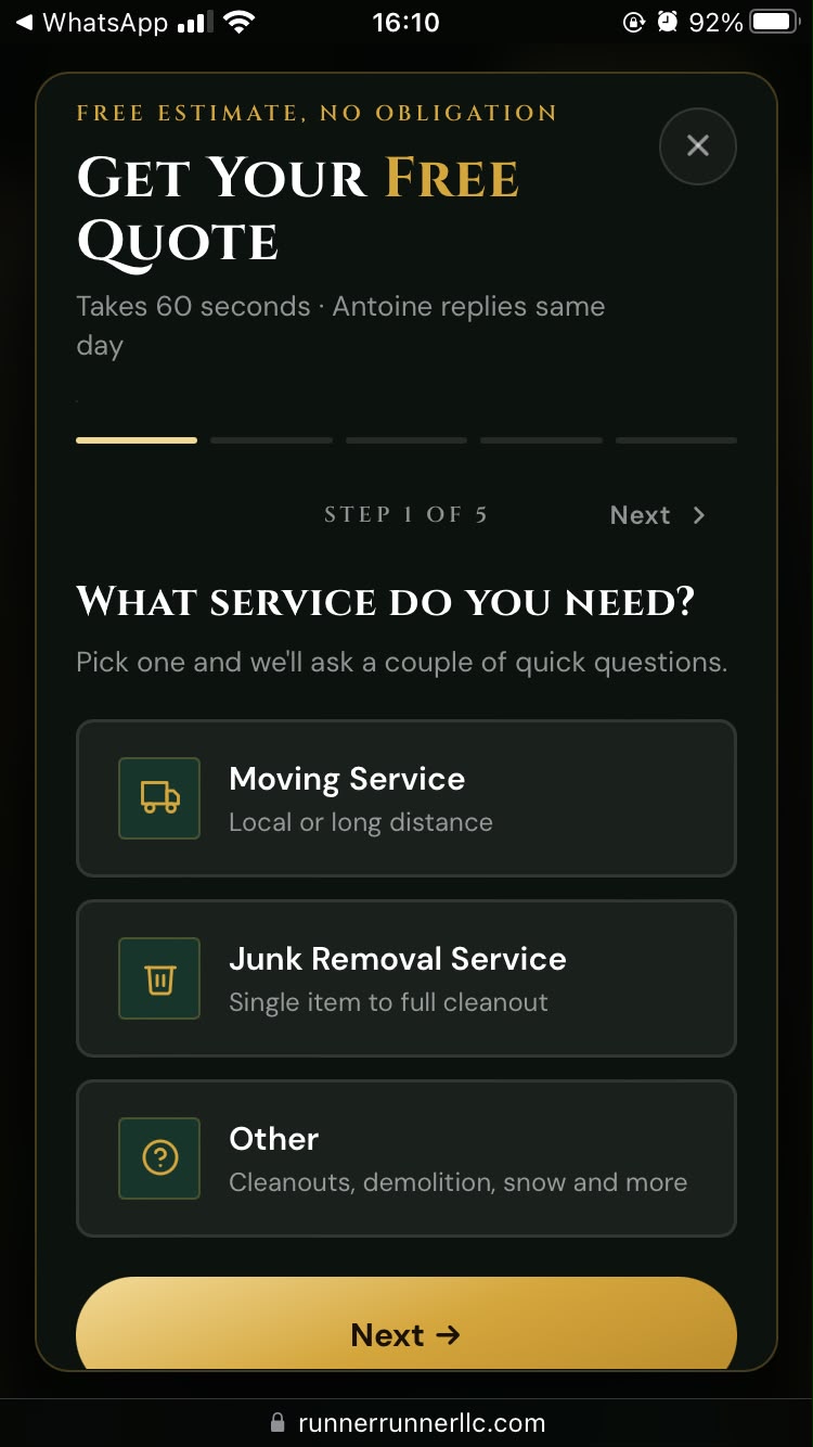
A quote form we built, as it looks on a phone.
Where The Visitors Actually Come From
This is why the phone comes first. When nearly everyone arrives on a small screen, a site that only looks good on a laptop is built for almost nobody.
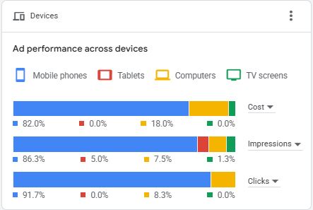
Device data from one of our Google Ads campaigns.
Protected From Spam And Fake Clicks
Spam submissions waste your time and fake ad clicks waste your budget. Forms get a captcha, ad traffic runs through a click fraud tool, and a few more safeguards sit in the code. More on the ad side on our Google Ads for moving companies page.
Color Sets The Mood Before Anyone Reads A Word
The Maryland Minority Contractors Association came to us with a strong red they wanted to keep. On their old website it sat on a plain white background, and it felt generic.
An illustration of the idea, not their exact shades.
We kept the red and put a warm cream around it. Same brand, one new color, and now the site feels like what the association really is: a warm community of people who help each other.
That's the job color does. It tells a visitor how a company feels before they've read a single line. For a mover, that feeling should be: these people are careful, and my things are in good hands.
It also has to be readable for everyone. We cover contrast and accessibility on our moving company websites page, along with speed, structure and how Google finds you.
The Rest Stays With Us
There are many more details we place on purpose, and we're not going to list them here. Our competitors read this page too, and they've had enough free lessons for one day.
If you want the full picture for your own company, that's what the strategy call is for.
Design You Can Measure
Pretty is an opinion. Conversion rate is a number: out of everyone who visits, how many reach out.
Focus Movers
Baltimore, MDDesigned around Baltimore customers from the first headline. More than one in four visitors reaches out.
Read the case study →Runner Runner LLC
Philadelphia, PAA site built around the owner himself, with honest pricing and plain promises. From fully offline to real traffic and leads.
Read the case study →Pet Exporters
Dallas, TXA site designed to convert, backed by a full lead system. Hear what the owner says about it in his own words.
Read the case study →The Design Is Free
When We Work Together
Research, design, copy and build are all included when you partner with us on your marketing. No separate design invoice. Most sites go live in about a week.
One moving company per city. When your city is taken, it is taken.
Moving Company Website Design Questions
How much does moving company website design cost?
When you partner with us on your marketing, the research, design, copy and build are included at no extra cost. There is no separate design invoice.
What makes a good moving company website design?
It is simple, familiar and built for the phone first. The sections are ordered to build trust step by step, the words are chosen for the customer you want, and the quote form is easy to finish.
Should my moving company website say affordable movers?
Not as the headline, unless price shoppers are the customers you want. Leading with cheap makes price the first thing people compare you on. Being clear about how your pricing works builds trust without doing that.
How long should my quote form be?
Long enough to price the job and short enough that people finish it. There is no single right number of fields, so we design the form for a phone, ask the questions in an easy order, and watch how real visitors use it.
Will my website have animations like yours?
Our homepage is where we show what we can build. Your site is designed for your customer, which usually means simple, familiar and fast. If a touch of personality fits your brand, we add it on purpose.
Can I keep my brand colors?
Yes. We work with the colors you already have and build around them. Often one supporting color changes how the whole site feels.
Do you write the copy too?
Yes. The words are part of the design. We write them after researching your market and your competitors.
Do you design websites for junk removal companies too?
Yes. We work with moving and junk removal companies only, and we take one company per city.
Want A Website Designed
Around Your Customer?
Let's look at your market, your competitors, and the kind of customer you want more of. Free strategy call, no pressure, and your city might still be open.
🚀 Book Your Free Strategy Call
The moving company marketing agency. SEO, Google Ads, websites and lead generation built exclusively for moving and junk removal companies. One city. One partner. Total domination.
© 2026 Move Accelerator. All Rights Reserved. Built to dominate. Designed to win.
Privacy PolicyTerms And Conditions
ONE CITY. ONE PARTNER. TOTAL DOMINATION.